About My LOTTE Font
MY LOTTE typeface
Introducing a typeface that embodies LOTTE DUTY FREE’s spirit,
which strive to be the global number in the travel retail industry.
-
Characteristics
-
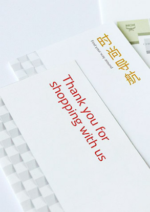
A diagonal line stretching upwards and LOTTE DUTY FREE’s visual identity, an origami pattern,
have been reinterpreted as a hidden arrow to express the "global leader" image of the industry.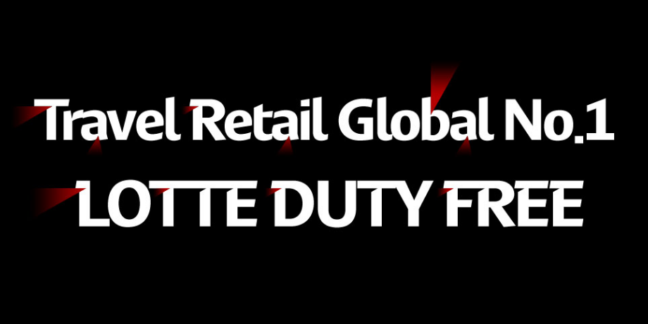
English typeface
MyLOTTE English typeface has the shape of a modern, sophisticated humanist sans font, expressing LOTTE DUTY FREE's brand identity of origami in a way that compliments the shapes of the letters.
The lines that extend diagonally from the top of vertical lines and the connecting strokes are especially great illustration of the LOTTE DUTY FREE font’s identity.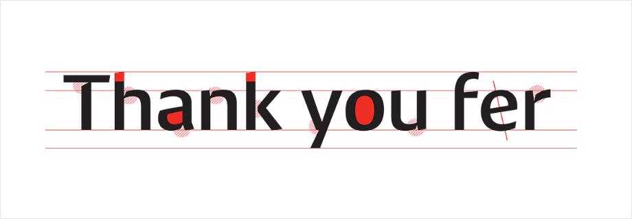
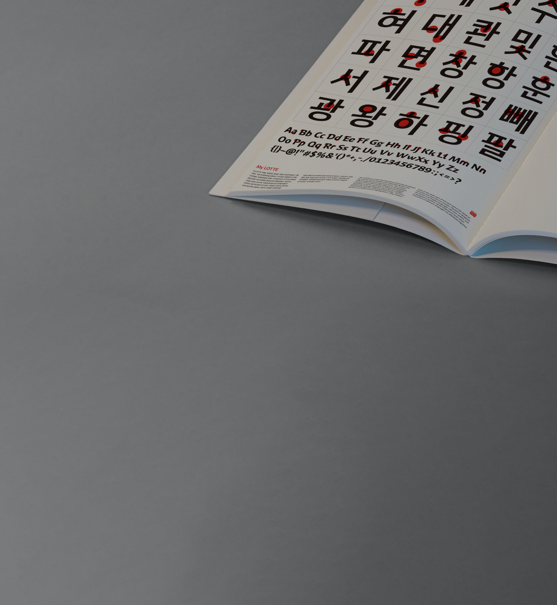
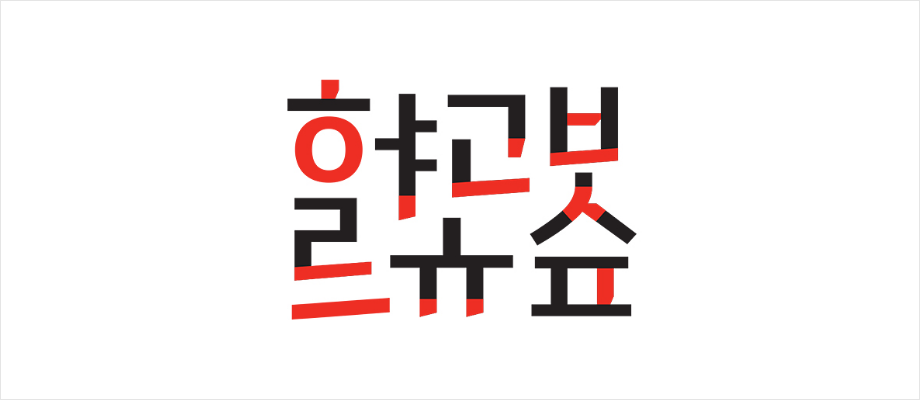
Korean typeface
Korean MyLOTTE typeface, considering its similarity with the English typeface, uses the origami pattern as its motif. It was also reinterpreted to compliment the form and characteristics of Korean lettering. The rising strokes compliant with Korean writing methods that connect consonants and vowels are expressed naturally, completing a modern and well-designed expression of the entire typeface.
Also, the middle vertical stroke connections in ㅏandㅣ, and the bendings and dips in the characters ㅈ,ㅊ,ㅂ, and ㅍ show its unique identity. The closed spaces in characters ㅇ and ㅎ have been distributed widely to express an open impression in the midst of explicit modern style.
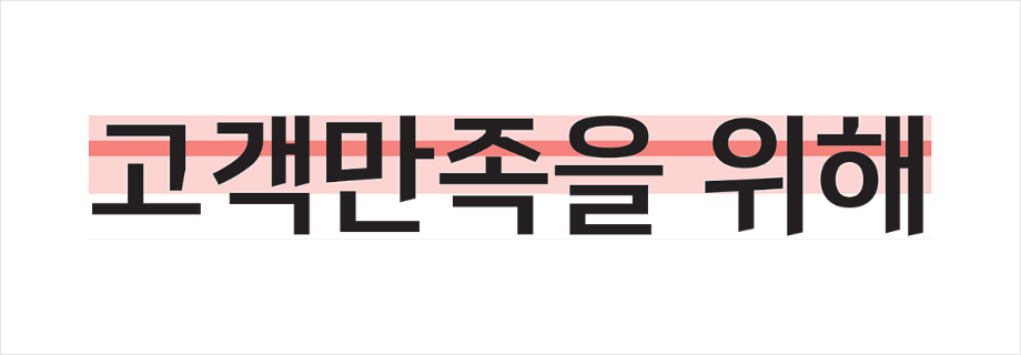
The MyLOTTE typeface uses regular and consistent fixed measurements, lending them a stable and consistent line width when typesetting. All four types of thickness have the same width, making regular and harmonious typesetting possible even when used together. Visual cut-offs were utilized depending on character structure and the number of stems to precisely adjust the height, producing a neat type line when the letters are typeset. The visual flow line was set to mid-high, strengthening the modern concept and naturally emphasizing the slanted line (granting high readability).
-
Examples
-
-
Awards
-
The MyLOTTE typeface won the “Best of the Best Award" in Communications and Typography category in the 2017 Red Dot Design Awards, which is the one of the top three design awards in the world, followed by the main communication award at the 2018 International Forum Design Award.