User Guide
Line and
font spacing
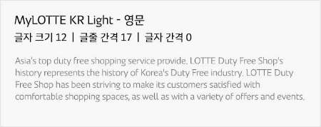
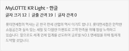
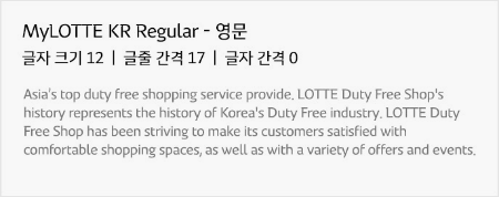
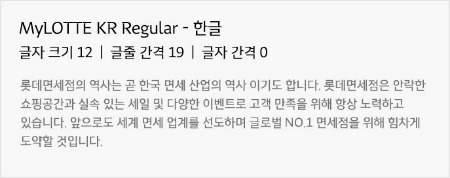
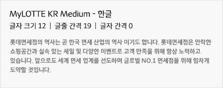
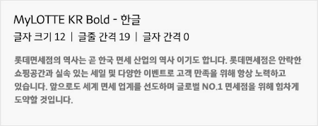
If two or more lines of the MyLOTTE typeface are used, it is recommended to set the line spacing to 1.4x or more for English and 1.6x or more for Korean.
If the MyLOTTE font is used in sentences, the recommended font spacing is 0 for both Korean and English.
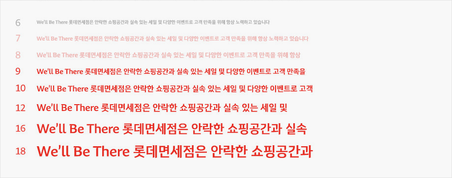
MyLOTTE Light
MyLOTTE Regular
MyLOTTE Medium

MyLOTTE Bold

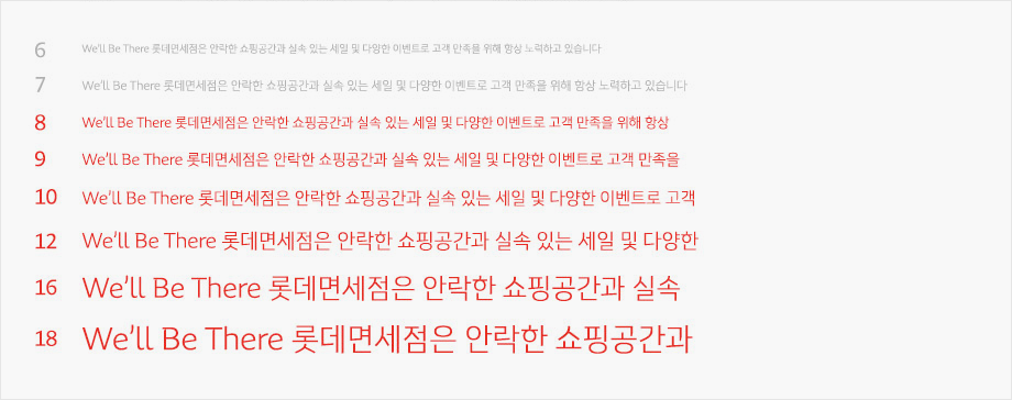
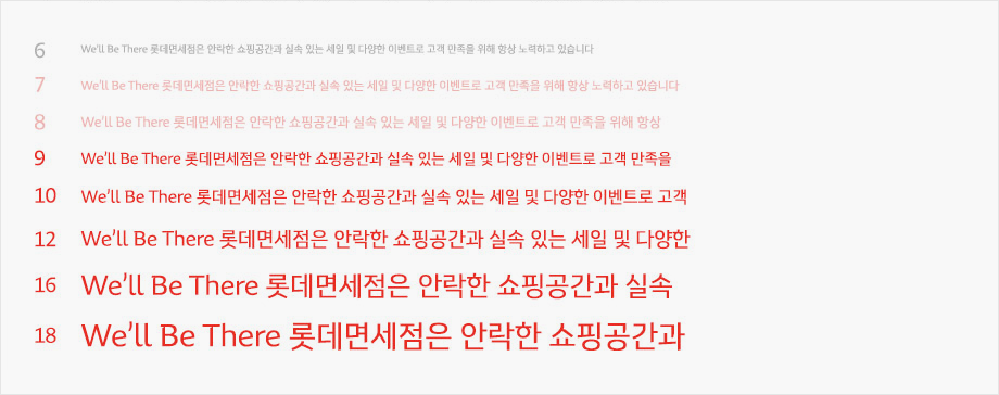
Minimum size
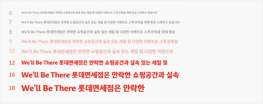
The MyLOTTE typeface may not be legible when used under the minimum size, and its identity may be distorted and damaged. Therefore, it is recommended to use the typeface above its minimum size.
(These are the recommendations when printing, based on 100 g white imitation material. Results may change slightly based on the paper's texture or color, or where the printer material is displayed.)
MyLOTTE Light
MyLOTTE Regular
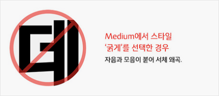
MyLOTTE Medium
MyLOTTE Bold
Restrictions
Adobe
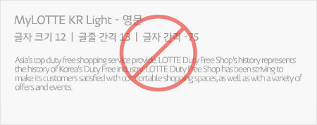
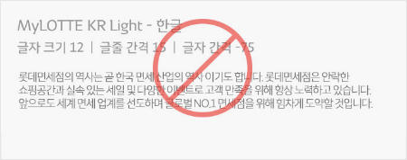
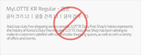
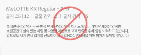
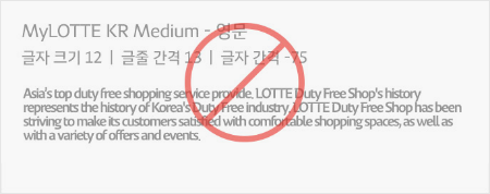
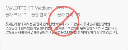
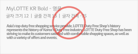
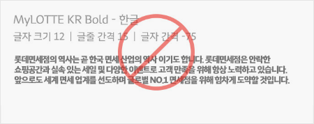
Caution is required to avoid distortion or alteration of the MyLOTTE typeface that may result in damage to the image.
The following images are examples of wrong use of the font; please refer to these to make sure no distortion of the typeface occurs.
- Original

- ① No character size adjustments

- ② No distortions between characters

- ③ No angular distortion

- ④ No borders

- ⑤ No width distortion

- ⑥ No shape distortion

- ⑦ No pattern application

- ⑧ No indiscriminate mixing with other typeface

Restrictions
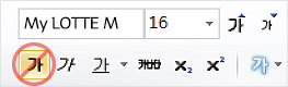
MS Office
No bold face usage
Instead of applying bold to the font, it is recommended to select the proper width measurements

The above specifications are based on the design concept; standards, quality, or creation process, and may differ depending on the purpose of use.